
A clinic floor plan may show two entrances, but visitors still need to know which one patients should use. The plan is useful only if its labels are readable, its date is clear, and the text explains what each entrance serves. On an architecture or property website, every visual should answer a question rather than fill a gap beside the copy.
Choose the visual for the decision
Start with what the reader needs to decide. A prospective tenant may be assessing daylight and the usable shape of a room. A public client may need to understand how a new building connects to an existing campus. A facilities manager may be looking for access and service routes. Choose the simplest visual that answers the relevant question.
- Photographs show existing conditions, finishes, scale and how spaces are used, though the camera angle limits what a viewer can judge.
- Plans and sections explain layout, circulation, levels and relationships that photographs may not show clearly.
- Annotated diagrams focus on one issue, such as pedestrian access, construction phasing or the boundary between public and restricted areas.
- Charts make figures easier to compare when units, assumptions and source dates are visible.
- Renderings show design intent. They should not imply that an unbuilt feature already exists.
A few different views often tell readers more than a large gallery of similar images. For a school extension, an exterior view can establish its relationship to the campus; a simple plan can show how teaching rooms and shared spaces connect to existing entrances. Neither visual needs to carry every project detail.
Give each visual enough context
Images can mislead without being edited. A wide-angle photograph can make a narrow room look more spacious. A cropped site image may leave out a busy road beside a quiet courtyard. An unlabelled rendering may suggest that landscaping or furnishings are included in an approved scheme when they are not. Captions should say what viewers are seeing and flag limitations that could affect a decision.
“Proposed east entrance, viewed from the existing pedestrian path” is more useful than “Welcoming entrance.” For an existing property, include the photography date if later work may have changed its appearance. For a proposed building, say whether the image shows a concept study, a submitted design or an approved one. If dimensions matter, give them in the text or on a clearly labelled drawing; don't ask readers to estimate from a picture.
Label drawings for non-specialist readers
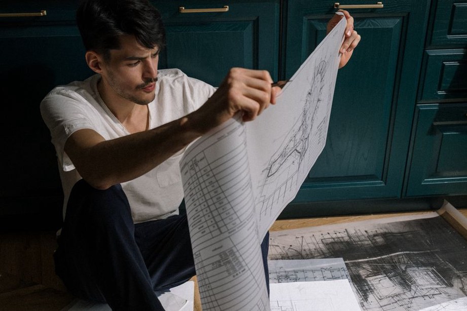
A design-coordination plan often contains more information than a web visitor needs. A public-facing version can keep the orientation, entrances, room names and a scale or key dimension, while leaving out technical layers unrelated to the page. Mark the route or feature discussed in the text. Then check the drawing at its actual on-screen size. If readers have to zoom into a blurry file to decipher the key, provide a sharper image or put the essential information in nearby text.
Don't use colour as the only way to distinguish routes or phases. Add labels, line styles or symbols, and check that they still make sense in grayscale. That helps readers with colour-vision differences as well as anyone using a printout.
Make visuals accessible without making them redundant
Alternative text should convey what an image adds, rather than repeat the page title or inventory everything in the frame. For a photo illustrating sheltered access, “Covered walkway links the clinic entrance to parking” gives the relevant information. A purely decorative background generally needs no spoken description. For a complex plan, short alternative text can state its purpose, while nearby prose or a text-based key explains the routes, rooms or measurements.
Text embedded in an image is easy to miss on a small screen or if the file fails to load. Put critical figures, deadlines and project-status notices in ordinary page text too. Give captions and labels enough contrast against their backgrounds. For a densely annotated drawing, offer a readable enlargement that people can open without a mouse.
Keep files practical for the page
A photograph needs enough detail to support its point, but an article rarely needs a full-resolution camera export. Export at dimensions suited to the site's display, use modern formats where supported, and check that compression hasn't blurred labels or material details. Responsive image sizes also keep a phone from downloading the same large file as a desktop screen.
Place each image near the passage it explains. Reserve space for it where possible so the page doesn't shift as files load. Keep essential facts, such as location, project status and accessibility arrangements, ahead of large galleries. The aim is to help readers use the page quickly, not just to make it appear quickly. For more on that distinction, see improving architecture website speed without losing usability.

Check accuracy, rights and maintenance
Before publishing, confirm permission to use each photograph, drawing or rendering, and record any required credit. Images of occupied homes, schools and healthcare settings need a privacy check too. Faces, address details, screens or personal belongings may reveal more than intended. A file can be cleared for use and still be unsuitable for a public project page.
Give visuals that may become outdated a status and a review trigger. Replace a construction photograph when it no longer reflects the completed building. Revisit a leasing plan if partitions change, and check an access diagram when routes are altered. Keep the source file and publication date with each asset so editors can trace what appeared on the page.
Before publishing a page about a proposed public entrance, open it on a phone. Check that the caption says “proposed,” the route is legible without colour, and the text states where the entrance will be. If any of those checks fails, revise the image or its explanation.