
A prospective tenant sees a leasing sign outside an office building, then visits its website a week later. If the name, colors, photographs and description bear little resemblance to the sign, they may not realize it is the same property. Recognition relies on cues people can connect across encounters, not just an attractive logo.
For architecture practices, developers and property owners, those encounters go well beyond marketing. A client may see a proposal, visit a site, read a construction notice and eventually enter the occupied building. Consistent branding helps them identify the organization or place at each point. It can make a business easier to recall and distinguish, but it cannot replace sound design, accurate claims or dependable service.
What consistency actually means
A brand is the set of associations people form with an organization, service or place. Its visual identity—name, logo, type, colors and imagery—is only part of it. Written language, staff behavior, document quality and the physical environment also shape what people recognize and remember.
Consistency does not require every touchpoint to look identical. A permit drawing must prioritize technical clarity; an entrance sign needs to be legible from an appropriate distance; a client presentation may need space for detailed diagrams. The question is whether each feels like the work of the same accountable organization while doing its own job.
A usable identity system can establish that continuity with a few rules:
- Names: one approved business or project name, with clear rules for abbreviations and legal entity names.
- Visual cues: defined logo versions, typefaces, colors and a photographic approach, including accessible alternatives.
- Language: a consistent way to describe services, project status, limitations and next steps.
- Experience: predictable standards for signs, correspondence, presentations and on-site information.
People do not need to notice each rule consciously. Repetition helps them connect a sign, document and website. The overview of brand consistency describes the idea as presenting a brand coherently across channels; for a building-related business, those channels include physical spaces as well as screens.
Why repetition helps memory—and where it falls short
Most clients do not compare providers in one sitting. A property owner might save a project photograph, hear an architect speak at a meeting and request a proposal months later. Familiar cues help connect those separate encounters. A distinctive project name used alongside the same restrained color palette and clear description is easier to identify than three unrelated presentations.
Recognition is not preference. Someone may remember a developer’s striking sign yet avoid the project if promised amenities are missing. A consistent visual identity can make an architecture practice familiar without proving it can deliver a particular building type. Repeated claims matter most when they match experience: a firm that promises careful cost control should provide understandable estimates and explain changes promptly.
Consistency also needs distinctiveness. Generic photos of glass towers, interchangeable slogans and common color combinations may appear on every channel and still say little about a particular practice or property. More useful differences come from verifiable work: the building types served, an approach to site constraints, stated operational priorities or photographs of completed spaces with accurate captions.

Start with the promise the organization can keep
Before choosing a typeface or commissioning a sign, write a short description of what the business offers and to whom. An architectural office might emphasize coordination across design and approvals; an office property might point to flexible floor plates and straightforward visitor access. The description should be specific enough to guide decisions and narrow enough to remain true.
“Sustainable” on its own is a weak promise. It might refer to energy use, material sourcing, adaptability or site planting. If the claim matters to the identity, say what the practice is and what evidence supports it. Likewise, calling a building “accessible” is no substitute for checking routes, entrances, lifts, toilets and signs against applicable requirements and users’ needs.
When a business serves several audiences, keep the core identity stable and change the level of detail. A prospective resident needs different information from a planning official or an investor. The name, essential facts and tone can stay recognizable even when a technical submission is much more detailed than a public brochure. Neither should give a different floor area, opening date or intended use.
Build a practical reference, not an oversized rulebook
A short brand guide earns its place when people can use it in daily work. Include the approved name and project naming convention; logo files and minimum sizes; color values for print and digital use; type hierarchy; examples of headings and captions; photography permissions; and templates for proposals, notices and presentation boards. Show common errors too, such as a stretched logo or pale lettering over a photograph.
Keep project facts in a separate, maintained source. A visual guide cannot settle whether a development has 48 or 52 apartments, whether parking is included in a lease, or which construction phase is complete. Assign someone to own those facts and record when they were last checked. Otherwise, an old brochure, website page and site hoarding can circulate different answers.
Make the identity work in the built environment
A building is not a printed brochure. Materials weather, lighting changes, and people approach from different directions and at different speeds. A concept that works on a laptop may fail on a façade, reception desk or construction fence. Test physical applications at their intended scale and location before treating a rendering as proof.
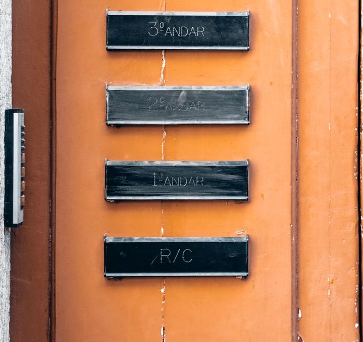
For an occupied property, follow the visitor’s approach: what they can see from the street, where they enter, how they find reception and how they confirm they have reached the right place. The property name might appear on an external sign, at the entrance and on a tenant directory, but each instance needs a different size and level of detail. Building identification should help people orient themselves, not compete with safety signs or obscure directions.
Legibility matters more than reproducing a marketing palette exactly. Contrast, illumination, mounting height, viewing distance and glare affect whether a sign works. Accessible communication may require tactile or other formats alongside visual branding, subject to local rules and the building’s use. The U.S. Access Board’s guide to accessible signs illustrates how requirements can address characters, placement and tactile information. Check the standards that apply in the project’s jurisdiction; a brand manual does not override them.
Temporary construction graphics need coordination too. Hoardings can identify a project and explain what is being built, but proposed completion dates and facility claims need approval before publication. Local sign permissions, sightlines, maintenance access and weather resistance may constrain the layout. A current construction notice with reliable contact details is often more useful to neighbors than a large aspirational image without them.
Allow the architecture to remain itself
Brand consistency should not make every building a copy of the last. A practice can use the same drawing conventions, project descriptions and presentation structure while designing differently for a school, clinic or workplace. A developer can communicate in a recognizable way while responding to each site’s materials, scale and surroundings.
That distinction matters when identity affects finishes. Specifying a signature color throughout a healthcare interior may conflict with wayfinding, cleaning requirements or the need for a calm clinical setting. Repeating façade materials across sites can ignore climate, maintenance and context. Treat branded elements as one part of the design brief, tested against performance, use and place—not as decisions that settle the architecture in advance.
Carry consistency through the client’s experience
For a service business, ordinary documents are often the most influential touchpoints. A proposal should use the same scope, project name and contact roles as the later appointment paperwork. Meeting notes should use familiar stage names and separate decisions from open questions. If the organization promises transparency, a change notice should explain what changed, why, and the effect on cost or schedule. Polished formatting alone will not do that.
Property businesses have a similar chain of handoffs: listing, viewing, application, lease or sale documents, move-in information, maintenance requests and building notices. Residents and tenants should recognize official communications without guessing whether an unfamiliar email address or differently named portal is legitimate. Consistent sender names, property names and contact instructions help; personal information still needs careful handling.
Digital and physical materials must agree. A website may show the current entrance on a map while an older PDF still sends visitors to a temporary construction gate. No visual system fixes that on its own. Put changes to entrances, opening hours, accessibility provisions and key contacts through a shared update process, with someone responsible for checking every affected channel.
Adapt across audiences without fragmenting the brand
Each channel has its constraints. A small mobile screen needs concise labels; a planning exhibition needs diagrams people can grasp at a glance; a technical report needs complete qualifications. Keep recognizable elements, including the project name, document hierarchy and factual descriptions, while adapting the layout and language to the task.
Sub-brands need particular care. A developer may own several buildings, each with its own name and tenant audience. Making them identical erases useful differences; making them unrelated can hide who is responsible. One workable approach gives each property a place-based identity while identifying the owner or manager consistently in contracts, notices and contact information. Decide where that parent identity belongs and where it would add clutter.
The same applies to an architecture practice with specialist teams. Healthcare and education projects call for different examples and technical vocabulary, but clients should not receive conflicting accounts of the firm’s process or responsibilities. Shared templates can cover common information while leaving teams room to explain their projects’ particular constraints.
Check whether consistency is helping
A brand audit does not have to begin with a costly redesign. Gather what a client or visitor might encounter: search results, website pages, a proposal cover, a project board, the entrance sign, a directory, an email signature and recent notices. Put them side by side. Look beyond mismatched names and logos to outdated facts, unexplained acronyms, conflicting contact details and directions that fail on site.
Then ask a few people unfamiliar with the project to follow the same chain. Can they tell which documents come from the same organization, find the entrance using the published directions and locate the right contact for a specific issue? Their mistakes tell you more than a general opinion about whether the design looks attractive. Staff who answer calls or meet visitors can also point to confusion a desk review misses.
Choose measures that fit the intended outcome. Appropriately designed recall or identification questions can explore recognition. Operational signals might include arrivals at the wrong entrance, repeated requests for basic project facts or inquiries sent to the wrong team. None proves on its own that branding caused a business result; location, pricing, service quality and market conditions also affect decisions. Compare like with like, then fix specific weak points rather than crediting a new color scheme with increased revenue.
Give updates an owner
Consistency slips when no one manages changes. Assign approval responsibilities for identity files, project facts, physical signs and public claims. Keep current templates in one accessible location and retire old versions. Review information when it is likely to change: after planning decisions, before leasing launches, when construction access shifts and before opening.
Start by checking the project name on four items people may see together: the site sign, website landing page, visitor directions and latest client notice. If one uses an old name or sends visitors to a different entrance, correct it—and name the person responsible for keeping those four items aligned next time.