
A paint chip held beside a living room window can look quite different on the wall behind the sofa. In a small room, wall color occupies a large share of what you see, so check the daylight, fixed finishes and furniture before settling on a shade.
Identify what the palette has to work with
Start with what will stay: flooring, window frames, doors, built-in storage, a large sofa, and any exposed brick or stone. Their colors and undertones set the terms for the rest of the palette. A warm oak floor may sit comfortably with warm off-white or muted green, while a cool blue-gray wall can make the timber appear more orange by contrast. Either can work if that contrast is intentional.
Pay attention to where each finish appears. A dark floor covers a broad horizontal plane; a dark bookcase forms a smaller vertical block. Calling both simply “dark” overlooks their different effects. If a permanent finish has a busy pattern, quieter walls and larger upholstery pieces can give the eye somewhere to rest.
Check daylight at the times the room is used
Look at the walls in morning, afternoon and evening light. In the Northern Hemisphere, a north-facing room often receives cooler, more diffuse daylight, while a south-facing room may get stronger direct sun. But orientation is only a guide: nearby buildings, trees, glazing and window size can matter more. Check the room’s lamps as well. A sample that looks clean at midday may appear yellow, gray or unexpectedly bright at night.

Set a hierarchy, not a rigid color formula
Think in terms of a dominant background color, a supporting color and a few accents—not exact percentages. Walls usually provide the background. A sofa, rug or curtains may make up the next largest area of color, while lamps, artwork and cushions can add accents without committing a whole wall to them.
Consider sightlines before assigning colors. If the living room opens into a hall or kitchen, the walls need not match, but their colors should work when seen together. Repeating an undertone or carrying the same trim color between spaces can make the transition feel deliberate. An enclosed room has more freedom to differ because the doorway provides a clear boundary.
Choose the background by the effect you need
- For a lighter, quieter backdrop: try an off-white, pale beige, light gray-green or another low-saturation shade. Compare it with the trim and floor for undertones that clash.
- For a more enclosed feel: consider a deeper mid-tone on several walls. One dark accent wall is not the only option; modest contrast between adjoining walls can help the room feel cohesive.
- For a clear focal point: use the strongest color on a defined feature, such as a built-in bookcase. Give it enough area to look intentional, and check its balance against the sofa and windows.
White does not automatically make a small room seem larger, and dark paint does not automatically make it feel cramped. Daylight, furniture scale, contrast, clutter and the visibility of the room’s edges all affect perceived size. Choose for the room in front of you, not for a rule about light and dark.
Manage undertones and contrast
Undertones become easier to spot when you compare colors directly. Set two candidate neutrals beside a plain white sheet, then check each against the flooring and sofa fabric. One “white” may lean pink and another green; gray can read blue beside warm timber. Try candidates on different walls rather than relying on a small sample card.
Use contrast where it helps define the room. A pale sofa against a pale wall can create a calm, continuous field, though a darker rug, cushion or nearby table may help distinguish the furniture. A dark sofa against a dark wall can work too, provided its texture or outline remains visible. Every object does not need a contrasting border.
Visibility matters especially if residents have impaired vision. Doors, handles, switches and changes in level should be easy to identify; at a threshold or step, clear recognition takes priority over a subtle color scheme.
Use materials to carry color
Paint is only part of the palette. A rug can bring warmth without changing the walls, curtains can repeat the sofa color at window height, and timber or metal finishes can add contrast without introducing another strong hue. Include those materials when counting colors. A scheme that looks simple on paper may feel crowded once the floor, furniture and artwork are in place.
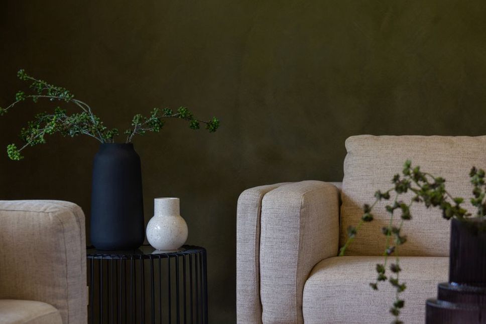
With a warm wood floor and cream sofa, one possible direction is muted warm green walls, cream trim that relates to the sofa, and small rust or dark-brown accents. Cool gray flooring and black window frames might be easier to pair with soft blue-gray or neutral off-white, with warm textiles to soften the result. Treat these as starting points, not replacements for testing samples in the room.
Test the palette before buying enough for the room
- Narrow the wall color to two or three candidates and obtain samples in the intended finish.
- Paint large sample boards, or use removable samples that accurately represent the specified paint. Move them between a bright wall, a shaded corner and the wall behind the main seating.
- View each sample in daylight and under the lamps normally used at night. Where possible, place sofa fabric, flooring and trim samples beside it.
- Check an accent color in an object or fabric close to its intended size. A vivid shade that works on a small chip may dominate a full-length curtain.
- Confirm the color and finish together. Matte and higher-sheen finishes reflect light differently, and a finish chosen for easier cleaning may show more wall imperfections.
Record the exact color name, product and finish of the approved sample before ordering paint. Then place the chosen board beside the sofa after dark and turn on the lamps you normally use. It is a simple way to catch a mismatch that daylight concealed.