
Someone standing outside a building needs to know which entrance to use. If its website makes them pinch and zoom to find the address, then dismiss a menu covering the screen, it has made a simple task difficult. Mobile-friendly design means making information usable where people need it, not merely squeezing a desktop page onto a phone.
Small screens change how people use a site
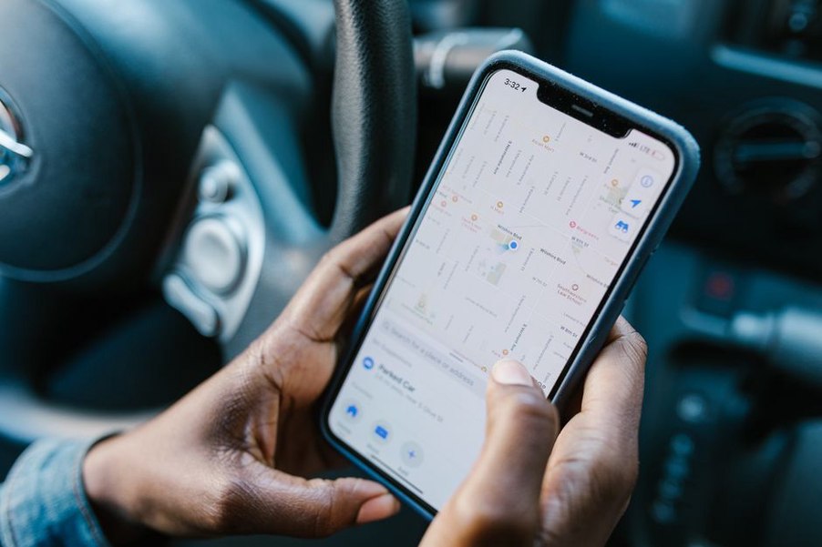
People check websites on their phones while travelling, switching between apps or dealing with an unreliable connection. Their immediate needs may differ from those of someone researching at a desk. A prospective tenant might check a floor plan on the way to a viewing; a patient might confirm which entrance serves a clinic; a client might look up a project address before a meeting. None should need careful, two-handed scrolling to find an answer.
A mobile-friendly layout adapts to the available space rather than shrinking a wide page until its contents become tiny. Text should be legible at normal zoom. Images and tables should not force sideways scrolling, and links and buttons need enough separation to tap accurately. These are usability requirements, not decorative choices.
What a cramped layout costs the visitor
On a desktop screen, a navigation bar, project photograph and contact panel may sit comfortably side by side. On a phone, the same arrangement might bury the contact details below a large photograph or force horizontal scrolling. The information is still there, but reaching it takes more effort.
That effort matters when a website helps people use a physical place. A missed tap or hard-to-read directions can send someone to the wrong entrance. If a form obscures its field labels, a visitor may be unable to request an appointment. Property and architecture sites also need to make room dimensions, accessibility features and construction phases easy to compare: these details inform real decisions.
Priority comes before rearrangement
Responsive design uses flexible layouts that adjust to screen width, but rearranging elements is not enough. If a large gallery appears before the address, hours and access instructions, stacking everything vertically keeps the same priority problem. First decide what visitors need to find; then work out how to present it at different screen sizes.
On a public building page, the correct entrance, opening hours and transport information might belong near the top. A project profile may need a short introduction covering its location, building type and current status before detailed drawings. Visual material still matters, but it should not get in the way of common tasks.
Mobile-friendly details that improve real tasks
Many useful improvements are small enough to check directly:
- Readable text: Use a comfortable base size, adequate line spacing and clear contrast. Avoid placing essential labels inside photographs, where the background can make them hard to read.
- Reliable navigation: Use descriptive menu labels, and make the menu easy to open, close and use with a keyboard. Visitors should not have to guess whether “Visit” contains directions or a booking form.
- Usable controls: Leave enough size and space around links, buttons and form fields for touch. Put labels beside or above fields instead of relying on placeholder text that disappears when someone starts typing.
- Flexible media: Keep images within the screen width. Let users inspect detailed plans without making a tiny thumbnail their only option.
- Manageable page weight: Size and compress photographs appropriately. A responsive layout helps little if oversized images delay the address or contact details on a mobile connection.
Accessibility and mobile usability overlap, but one does not replace the other. Larger touch areas can help both a person browsing one-handed and someone with limited dexterity. Proper headings help screen-reader users and make long pages easier to scan. Check color contrast, too: a page that looks clear on a bright office monitor may be harder to read elsewhere.
Plans, maps and documents need special treatment
Architecture and property websites often contain material made for large-format viewing. Room labels can vanish when a floor plan is reduced to phone width, while a dense comparison table can turn into microscopic text. Hiding that information on mobile is rarely the answer. Give the essential facts in concise text alongside the visual, and let users open a higher-resolution version when they need the detail.
Tables need to keep the relationship between each label and its value clear. A short table may fit if its columns are simplified; a wide technical schedule may work better as a downloadable document with an HTML summary. Give maps a written address and entrance instructions as well, since an embedded map can be awkward to use or slow to load.
How to check whether a site actually works on a phone
A narrow desktop browser window can reveal layout problems, but it will not reproduce every issue with touch, keyboards or connections. Test on at least one real phone, and check several page types: the homepage, a long article, a project page, the contact page and any form visitors need to complete.
- Start with a task, such as finding the accessible entrance or submitting an enquiry. Count the steps and note where the next action becomes unclear.
- Read at normal zoom. Check headings, captions, dimensions and form instructions for legibility.
- Use menus, galleries and forms by touch. Look for controls that sit too close together or disappear behind fixed banners.
- Rotate the phone and increase its text size. Content should remain available without overlapping or being cut off.
- Try a slower connection if possible. Check whether essential text appears before large images finish downloading.
Analytics can show which pages receive mobile visits and where people abandon a form, but they cannot establish the cause on their own. Pair those signals with hands-on checks and, where possible, feedback from people doing the tasks visitors actually face. A drop-off might point to a confusing field, an irrelevant form or a practical issue outside the website.
As a final check, open a building’s contact page on a phone. Can you find its street address, correct entrance and contact method without zooming? If any of those details appears only inside a plan or below a gallery, give it a clear position in the page text.