
A customer enters a shop, stops just inside the door, and looks for the service counter. If neither the route nor a place to ask for help is obvious, more signs may not solve the problem. Entrance placement, sightlines, aisle widths, lighting, and counter location all affect how easily people can use a commercial space.
Consumer engagement is not about keeping everyone inside longer. Someone collecting a prescription may want a quick, private visit; a showroom visitor needs room to compare products; a café customer needs a route to seating that avoids the order queue. The layout should support the activity at hand without making routine tasks harder.
Start with the visit, not the visual concept
Before drawing a floor plan, list the main reasons people visit. A retailer may serve browsers, online-order customers, people seeking advice, customers making returns, and companions. They enter through the same door, but their routes, time on site, and privacy needs differ. Tracing those visits can reveal conflicts an attractive rendering hides.
For each type of visit, note the arrival point, first decision, destination, likely questions, transaction, and exit. Map employees’ work too: deliveries, stock replenishment, order preparation, and oversight of the sales floor. A fitting room beside a busy pickup counter can make waiting uncomfortable even if both fit on the plan. Put a return desk at the back, and customers may have to carry bulky items through the entire store.
Set a few measurable goals in the brief. These might include reducing the time it takes to find the service desk, keeping peak queues out of circulation routes, making more displays reachable, or increasing use of a demonstration area. Sales figures alone cannot tell you whether a layout works; pricing, inventory, staffing, and promotions affect them too. Pair business measures with observations of access and comfort.
Make arrival legible
The first few metres should explain the space. A visible entrance ought to lead toward a recognizable main route, rather than present several identical aisles at once. At the threshold, a visitor should be able to spot at least one useful destination: a staffed counter, a featured category, a waiting area, or a directional sign. Glazing may help, but displays, door frames, security equipment, and reflections can still block the view.
Allow room for the pause at the door. People stop to orient themselves, close umbrellas, manage bags, or let others pass. A promotional island or queue placed there turns that pause into congestion. On the plan, show the door swing, any security gates, wheelchair turning space, and a small group entering together. Check accessible routes and egress dimensions against the applicable local code; an opening that looks wide is not necessarily compliant.
Use a hierarchy visitors can read
People read more than arrows. A change in ceiling height, a well-lit counter, a consistent aisle pattern, or a distinct material at a department entrance can signal direction. The cues need to agree. If a bright focal wall pulls visitors away from checkout while signs point toward it, the architecture and graphics are working against each other.
Check sightlines from seated and standing positions, including views partly blocked by other people. Put short, clear signs where choices occur, not just above the destination. Screens can display changing information, but the main routes should still make sense when a screen is off or showing something unrelated.
Plan circulation around behavior and peak loads
A useful plan lets people browse without holding up visitors with a specific task. Connect major destinations with a primary route and use secondary paths for slower exploration. Neither route has to form a rigid loop. Product size, visit length, staff supervision, and the use of carts, strollers, or mobility devices all influence the arrangement.
Draw the busy period separately. Show where a checkout line begins, how far it might extend, and which doors or displays it could block. Repeat the exercise for fitting rooms, café pickup, customer service, and popular demonstrations. A queue that fits neatly on an empty plan may spread when people arrive with companions or carry purchases. Temporary fixtures must not take over the clear route needed for access or emergency movement.
Trace staff routes as well. If restocking repeatedly cuts across a narrow browsing aisle, reconsider the route, storage position, or replenishment schedule. In a service-heavy space, keeping consultation, storage, and payment close together can reduce interruptions. Routine work need not be invisible, but it should not create avoidable conflicts.
Give different activities the right kind of space
Comparing products, talking with staff, trying something out, waiting, and making a quick purchase call for different settings. Demonstrations need space for onlookers outside the through-route. Consultation needs speech privacy and somewhere to put personal belongings. At a self-service station, customers should be able to step aside for help without blocking the next person.
Fixtures can define these areas, but their height and position matter. A tall display may hide a help desk or limit staff oversight. Lower fixtures near intersections often keep views open; taller ones may work along the edges. Size the layout around real merchandise, equipment, and customer actions rather than generic fixture symbols.
Design waiting as a visible, usable function
Waiting often disappears from early plans because no transaction happens there. Customers still wait for fitting rooms, appointments, food, repairs, and assistance. Give them a place clear of circulation, a way to tell whose turn is next, and seating when the likely wait calls for it. Privacy matters too: someone discussing a health-related purchase should not have to speak across an exposed queue.
In more complex premises, keep waiting apart from the flow of people arriving and leaving. A small recessed area may be enough if staff can see it and people with different mobility needs can use it. Required exit routes are not overflow waiting space.
Control sensory conditions without overpowering the visit
Lighting should let people judge products, read information, and recognize where one activity gives way to another. Use ambient light alongside focused lighting for displays, work surfaces, and service points. Check glare from glazing, polished floors, packaging, and screens at the positions customers actually occupy. A spotlight that looks striking in a rendering can make a label hard to read.
Color rendering and consistency are important when customers compare clothing, food, finishes, or materials. Daylight may aid orientation and make a room pleasant, but direct sun can fade merchandise and increase cooling loads. Plan shading, display locations, and lighting controls together rather than assuming daylight replaces electric light.
Noise can make a visit tiring. Hard ceilings, exposed services, music, conversation, and mechanical equipment all contribute. Keep loud demonstrations away from consultation areas, and place absorptive finishes where shelving and occupancy will not cancel their effect. Background sound is no substitute for speech privacy. In food premises, consider kitchen noise and the movement of odors alongside the dining area’s atmosphere.
Make access part of the customer visit
An accessible entrance is only a start. Customers must also be able to reach displays and counters, understand information, use facilities, and leave safely. Regulations establish minimum requirements; the operational question is whether the usable route is also direct and dignified. The U.S. Department of Housing and Urban Development’s accessibility resources offer context on access obligations, but project teams must check the codes and standards that apply to their building and location.
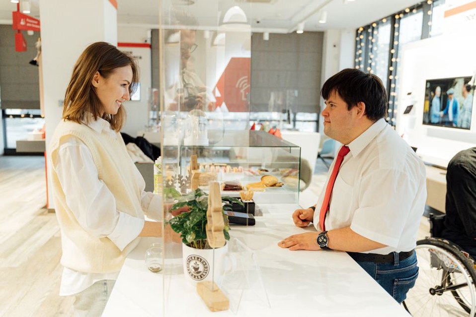
Review reach ranges at interactive displays, counter heights and approach space, seating choices, door hardware, and sign readability. Check again after opening so promotions do not narrow an accessible route. If lighting or sound varies by zone, customers should be able to request help without entering the most stimulating area. The same choices can help people carrying packages, accompanying children, or finding their way through an unfamiliar building.
Coordinate the front of house with the building behind it
A commercial floor plan depends on loading, waste handling, storage, ventilation, plumbing, power, fire protection, and maintenance access. Café seating may seem generous until delivery and refuse routes are added. A movable display wall is less useful if each rearrangement needs electrical work or interferes with sprinkler coverage.
Separate fixed infrastructure from elements expected to change. Plan power and data for displays that will move, while keeping controls and maintenance panels accessible. Check structural loads for heavy merchandise or equipment, particularly in conversions. For tenant improvements, establish what the existing building can support before committing to a layout that needs new exhaust, plumbing, or openings.
Finishes need to work after the opening month. Entrance floors must withstand traffic and the operator’s cleaning methods. Upholstery and acoustic materials should match the maintenance capacity available. Details that collect dirt, chip at cart height, or require a specialist to replace a panel can wear badly. Assess materials against expected use and replacement intervals, not just samples under ideal lighting.
Measure whether the design works after opening
A post-occupancy review helps distinguish layout faults from operating problems. Observe comparable days and time periods. Note where people hesitate, turn back, ask for help, leave a queue, or stand in a required route, then compare what you see with the original visit maps. Ask staff what they notice; repeated questions and bottlenecks may show up in daily work before they appear in sales figures.
Depending on the brief, useful measures include:
- Orientation: time or number of decisions needed to reach a common destination.
- Congestion: how often queues block an aisle, door, or display during busy periods.
- Use: whether customers enter intended zones and can interact with the products or services there.
- Service: wait time, staff travel, and how often customers ask for directions.
- Comfort: recurring complaints about glare, noise, seating, temperature, or privacy.
Read the results carefully. A display may get little use because it is hard to see—or because it holds the wrong stock. Change one variable at a time where practical, and record layout changes alongside staffing and promotions. A short observation study may support moving a sign or fixture; major alterations need better evidence and a review of cost and code implications.
Protect flexibility without leaving the plan unresolved
Assortments, services, and technology change. Useful flexibility is specific: a bay that accepts two known fixture formats, a consultation room with power and data for several uses, or a queue area that can expand at seasonal peaks. An open floor is not automatically adaptable if columns, outlets, lighting, and storage leave only one workable arrangement.
Draw each proposed alternative at scale, including fixtures, customers, door swings, and staff routes. Recheck accessible circulation, exits, visibility, lighting, and service connections. Seasonal merchandise is especially likely to occupy space originally reserved for movement.
Before signing off, mark the busiest expected queue, a delivery in progress, and a customer using the accessible route on the same peak-period plan. If they cannot coexist without pushing a display into a doorway, revise the layout before the fixtures are ordered.